Giving your company a facelift might be necessary for survival, but that doesn’t mean you have to butcher your image in order to stand out above your competition. Staying relevant is tough – but before you make any drastic changes, be sure to assess what’s working best and what needs improvement.
Here are some messy branding fails that could have been averted.
5 Branding Mistakes and What to Learn from Them
1. The Met
Over its nearly 150 year history, the Metropolitan Museum of Art has maintained a brand that has only ever encouraged discovery and humanity’s connection to the past. The museum’s impact on art culture across the globe is indisputable. So when the Met announced their new logo and branding earlier this year, people were mostly surprised then disgusted to find that it doesn’t carry the same beauty or history that the establishment deserves.
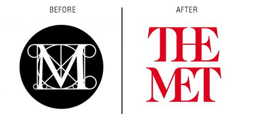
The new logo has been called a “typographical bus crash” by New York Magazine’s Justin Davidson, with most of the criticism falling on the strange white space that’s created between the disjointed ligatures.
2. Uber
Uber’s quick rise to fame has mostly been due to quick decisions, and good decisions at that. Unfortunately, their branding choices have not been so successful. A series of updated logos were released earlier this year that aimed to freshen up the company’s image and expand their vision. The results were befuddling to almost everyone.
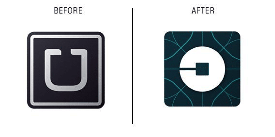
The new shapes and icons, representative of bits and atoms, are meant to inspire a more personal identity, but not everyone is on the same page. The general consensus seems to be that the lengthy videos and walls of text used to explain the new look prove that the process was a product of over thinking. Who has time for all that sciencey stuff?
3. Internet Explorer
Let’s face it; Internet Explorer has been the Comic Sans of browsers since the beginning of time. That lowercase “e” has been and remains a nightmare for web developers and is an ominous symbol of the past (a dark past, haunted by slow service and the squeal of a dial up modem). Which is why I’m sure with Microsoft’s announcement last year that rebranding for the browser was commencing was a cry for help to try to hold off extinction.
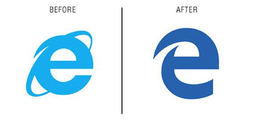
The result was a new name, “Microsoft Edge,” and an unforgettable new logo mark. Unfortunately, it’s a mark that people are trying to forget. Regardless of the browser’s performance (which is not as gut-wrenching as some would have expected), the fact that Microsoft refuses to break up with their old image means that they’ll have to haul the stigmas of their not-so-great past with them.
4. Deviantart
As someone who uses Deviantart daily, I’ve been fascinated to see a lot of responses about the site’s rebrand in 2015. Previously, the site featured a forum-like structure with a lovable mascot to boot. With such a heavy user base and a comfortable interface on the line, Deviantart’s rebrand was a risky thing.
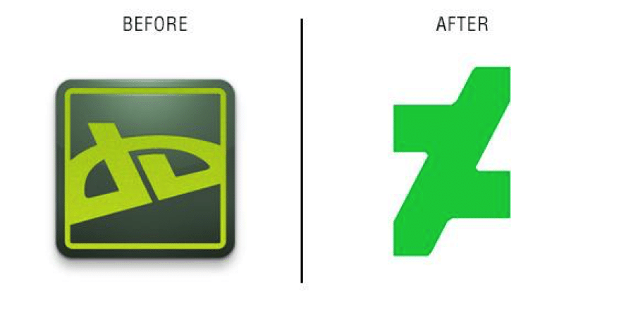
Immediately nostalgic users cried at the loss of their lovable character (which the site claims is still in use but sightings are sparse) as well as to the confusing logo that hacks off both edges of the site’s abbreviated namesake. (Not to mention the debate of plagiarism involving someone else’s logo.) The interface also took a hit with an infinite scrolling vibe that caters to Pinterest users. But we don’t go to Deviantart for recipes; we’re here for art!
5. Freeform
The addition of “Family” to ABC’s existing logo nearly 13 years ago was little more than slightly inspired (maybe). It certainly did enough to directly reference the target market, a move that has proved successful throughout the channel’s history – until recently. With some major new shows expanding their target market, the station’s family friendliness has been questioned. Execs took this into account and accepted that it was time for an update.
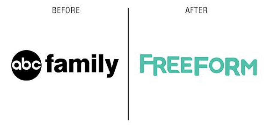
The drive towards a broader, younger demographic may have been a little…fast. The epilepsy-inducing teaser that was meant to visually introduce and explain the new brand is filled with snippets of the new cluttered logo and an extreme amount of target market stock footage. The flashy new feel is fresh, but one can’t help but feel that you’ve been handed an explosive amount of pop culture and you better love it because it’s so flirty and young and edgy and you’re all those things, right?
We’ve all seen some hilarious social media fails, but unlike Twitter posts that can be deleted, these bad branding decisions are here to stay. Which one do you think is the worst of the bunch?


.svg)